OTHER PROJECTS

Building a geopolitical AI tool with custom agents
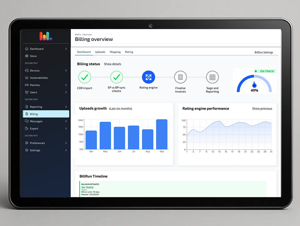
Turning billing complexity into a dynamic dashboard
IMPROVE WORKFLOW •USER RESEARCH(B2B) •USER GROWTH
Re-imagining the workflow
to drive retention
INTRODUCTION
Vantage is a cutting-edge intelligence platform designed to empower researchers and analysts with data-driven decision-making capabilities. This innovative tool seamlessly integrates advanced data processing and machine learning technologies to transform vast amounts of unstructured data into actionable insights.
Role
Sole Senior Product Designer
Timeline
November 2022- April 2023
Tools
Figma,GigJam, Jira, UserTesting

PROBLEM STATEMENT
While demos were well-received and sparked interest among users, post-sale engagement was quickly dropping. Despite having bought seats, users logged in infrequently and for short durations. Our users weren’t actually using the product much after onboarding. Since our target users weren’t the decision-makers, there was limited personal investment, making retention even more crucial.
The product supported various user types and offered multiple powerful features. But we hadn’t clearly communicated how these features connected to the users’ real-world goals. The experience lacked a guided workflow, leaving users to fend for themselves and since our target users main pain point was lack of time they just were just choosing to go back to their existing trusted methods.
Although this isn't unusual for a lot of B2B products I was tasked to investigate the main reasons that this was happening and improve our retention and most importantly daily use.
MY ROLE
As the sole designer, I took ownership of the entire UX effort to address user drop-off. I initiated the research, mapped our user workflows (with and independent of our product), redesigned some of the interactions, re-wrote most of the copy and collaborated closely with Customer Success and Engineering to ensure alignment with user needs and technical feasibility.
STARTING POINT
With minimal product analytics (you can’t measure what you don’t have), we had to get creative. I turned to our customer success team, with whom I had built a strong relationship. Together, we:
-
Mapped how users (new and returning) moved through the app.
-
Analysed frequently asked questions and support tickets.
-
Observed real users interacting with the product.
DISCOVERY
We quickly discovered a pattern: the product felt polished but offered no sense of direction. The previous assumption was that users would intuitively navigate to the tools they needed. In reality, users felt lost, confused, and unsure of what to do next. We mapped real user scenarios internally, documenting every dead-end and workaround users encountered while trying to complete tasks.
This helped us:
-
Identify our core user types
-
Understand the steps each type took to extract insights
-
Pinpoint UI components that needed redesign


SOLUTION
We implemented a number of tactical and structural improvements:
-
Redesigned the sidebar to act as a workflow guide. We've add our find feature at the top and ending with the
workspace at the bottom, mimicking the method that our users would use when starting a new project. -
Introduced contextual tooltips to explain UI elements and their purpose.
-
Added call-to-action buttons where the flow wasn’t clear, so users always had a clear next step.
-
Created onboarding modals to highlight key actions within each major capability on a user’s first visit.
These changes gave the platform structure, clarity, and purpose and really helped guiding our users through the product rather than leaving them to explore unaided.
IMPACT
This work took thoughtful design and meaningful engineering effort, but the results spoke for themselves:
-
24% increase in user logins
-
Nearly 50% increase in stickiness (return usage)
-
Users started giving feedback on specific features, a strong sign of deeper engagement
Unexpected bonus: The structured workflow made it easier for our sales team to demo the platform, improving pitch efficiency and consistency.


LEARNINGS
This project reinforced the value of collaboration with customer-facing teams and the importance of designing with context. Contrary to what was believed I found out that giving users structure doesn't restrict them it empowers them, especially when it is following a similar method to what they are already use it.
I also learned that small interface tweaks (like clear tooltips or CTA buttons) can dramatically reduce cognitive load and increase user confidence. It also taught me that previous assumptions such as “users will find their way” are dangerous in complex products.
Real value comes from designing pathways that mirror how users think and work.